Are you missing enrollment opportunities?
When companies increase the number of landing pages on their website from 10 to 15, they get 55% more leads. Without landing pages and web forms, parents who would normally inquire about your center, decide to contact the center across the street. This is because today’s parents are from the Millennial and Gen Z generations, and they prefer easy, online options – whether they’re shopping online or looking for childcare.
Lacking an effective landing page hurts your lead generation efforts and decreases potential revenue. Avoid these consequences by using a simple, drag-and-drop editor to design landing pages that are proven to capture interest from families. Read on to see how you can craft landing pages that convert.
What Is a Landing Page?
A landing page is a page on your website where you provide a solution or resource in exchange for someone’s contact information.
Landing pages are a vital part of marketing your childcare center. They’re used for the specific purpose of converting website visitors to leads, and eventually to an enrolled or waitlisted status. The right childcare CRM technology should give you the option to build an unlimited number of landing pages – with ease. Plus, landing pages with forms that automatically connect to your childcare experience platform software allow you to easily capture and organize new leads, coming from your website.
Landing pages are most commonly used for...
-
Capturing interested families from Google or social ads
-
Giving prospective families a place to quickly join your waitlist
-
Providing a way for parents to select a time slot and schedule a tour of your childcare facility
-
Allowing parents to inquire about specialized programs like summer camps, winter programs, potty training, and more.
Schedule a demo to learn more about childcare CRM software that helps you grow your enrollment with less work.
6 Landing Page Best Practices You Need to Follow
There are many examples of landing pages, but the intent stays the same – capture more high-quality leads. Landing pages should be created for a particular enrollment goal and are often promoted through digital advertising platforms. Check out these landing page best practices to improve your childcare enrollment efforts:
1) Keep Your Copy Concise
Almost 30% of landing pages have too much copy. Your landing page should have a brief, structured flow with a headline, a unique image that adds value or expresses your goal, and a Call-to-Action (CTA - what you want prospective families to do next).
2) Make Sure Your CTA Draws Attention from Families
Include an enticing CTA that will encourage your website visitors to submit their inquiries. A few recommended CTA's are: 'Submit,' 'Contact,' and 'Send.' However, you can also get a little creative and spice up your website with CTA's like: 'Say Hi!' or 'Get in Touch.'
3) Use Minimal Form Fields
The web form embedded on your landing page should also be succinct. Forms with 5 fields or fewer often result in the highest conversion rates. It's vital to remember this could be the first time a parent is interacting with your center. Because of that, make it easy for them to inquire. Consider removing fields like 'state, city, and country' with 'zip code' to keep it simple. This provides you with the same location-based insight but removes friction for inquiring parents or guardians.
4) Stay On-Brand
Include headers and form titles in fonts that are easy to read. Start by using a font that matches your brand and the rest of your website but try to avoid anything too decorative. Be sure to use colors that pair nicely with your logo or other website images but don’t overpower the actual content in the form.
5) Develop Your Page for a Specific Purpose
Your landing page should be separate from the main section of your website (including your homepage). The best childcare landing pages are built for specific purposes like center events, summer camps, scheduling a tour, or joining a waitlist. Ensure all copy and images follow the singular goal of your page. For example, don’t include pictures from last year’s summer camp if you’re trying to get families to attend an open house at the center. Instead, use photos of families visiting a past open house event.
6) Optimize Your Landing Page for Search
Prospective families often find your landing pages from Google or social ads, using specific keywords. Identify which words help you show up higher in the search results. Then, use those same keywords throughout the page. For example, a center located in Irving, Texas might use keyword phrases like 'daycare in Irving,' 'summer camp in North Texas,' or 'waitlist for daycare in Texas' when describing their services.
7 Examples of Outstanding Childcare Landing Pages
1) Bright Start
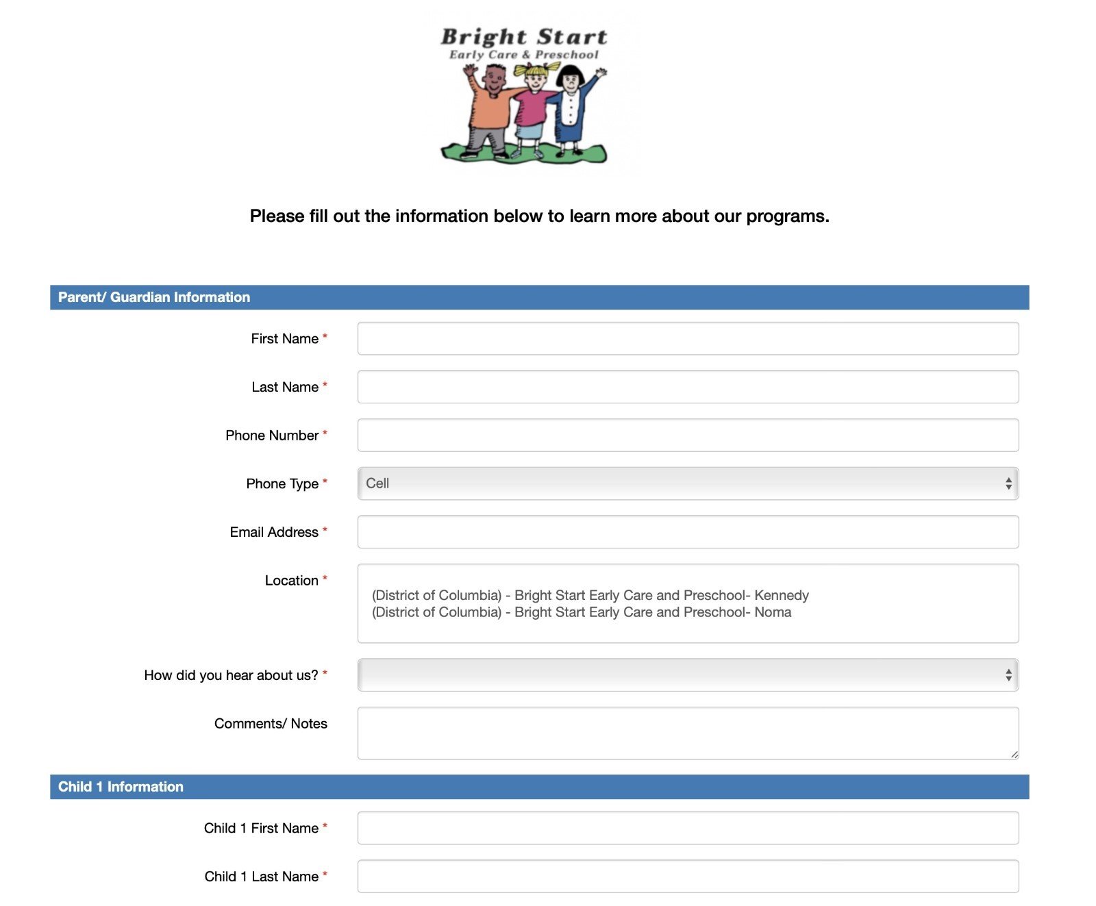
Landing page example 1: Bright Start Early Care & Preschool contact form
What Makes This Work:
-
Simple, clean design
-
On-brand colors and logo
-
Drop-down options for easy selection
2) New Horizon
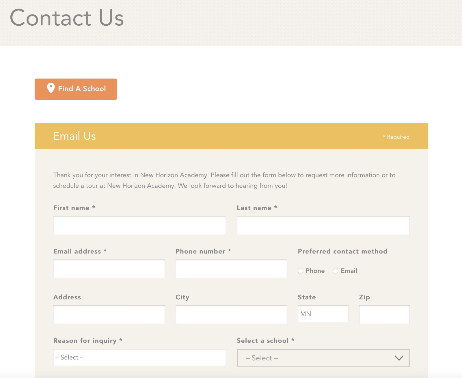 Landing page example 2: New Horizon Academy contact form
What Makes This Work:
-
Warm, engaging colors that match their brand
-
Minimal form fields that are easy to see
-
Simple, readable header
3) Tiny Treasures
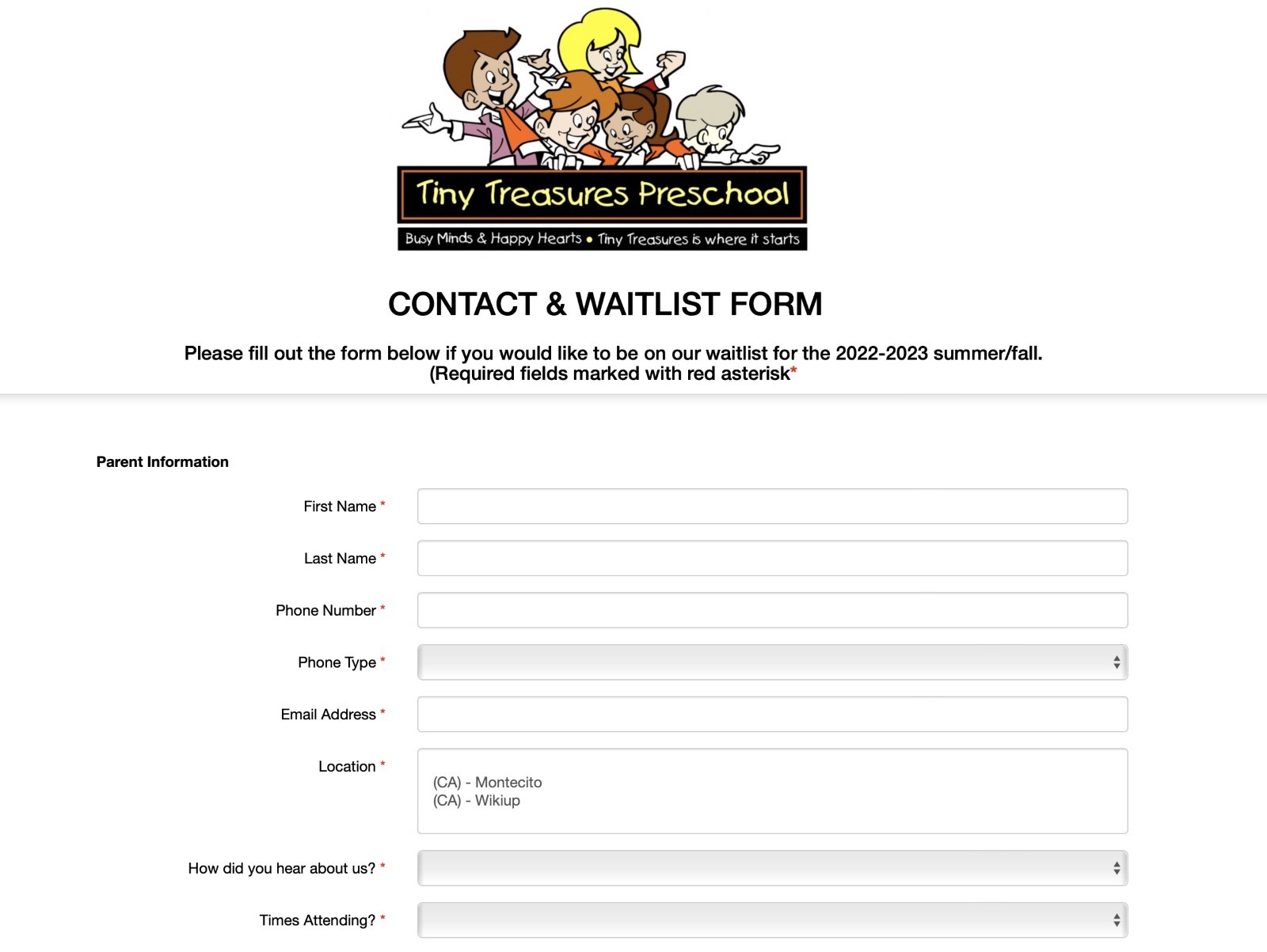 Landing page example 3: Tiny Treasures Preschool waitlist form
What Makes This Work:
-
Provides detail (required form fields)
-
Gives the waitlist season and year
-
Includes their slogan and logo
4) Kids R Kids
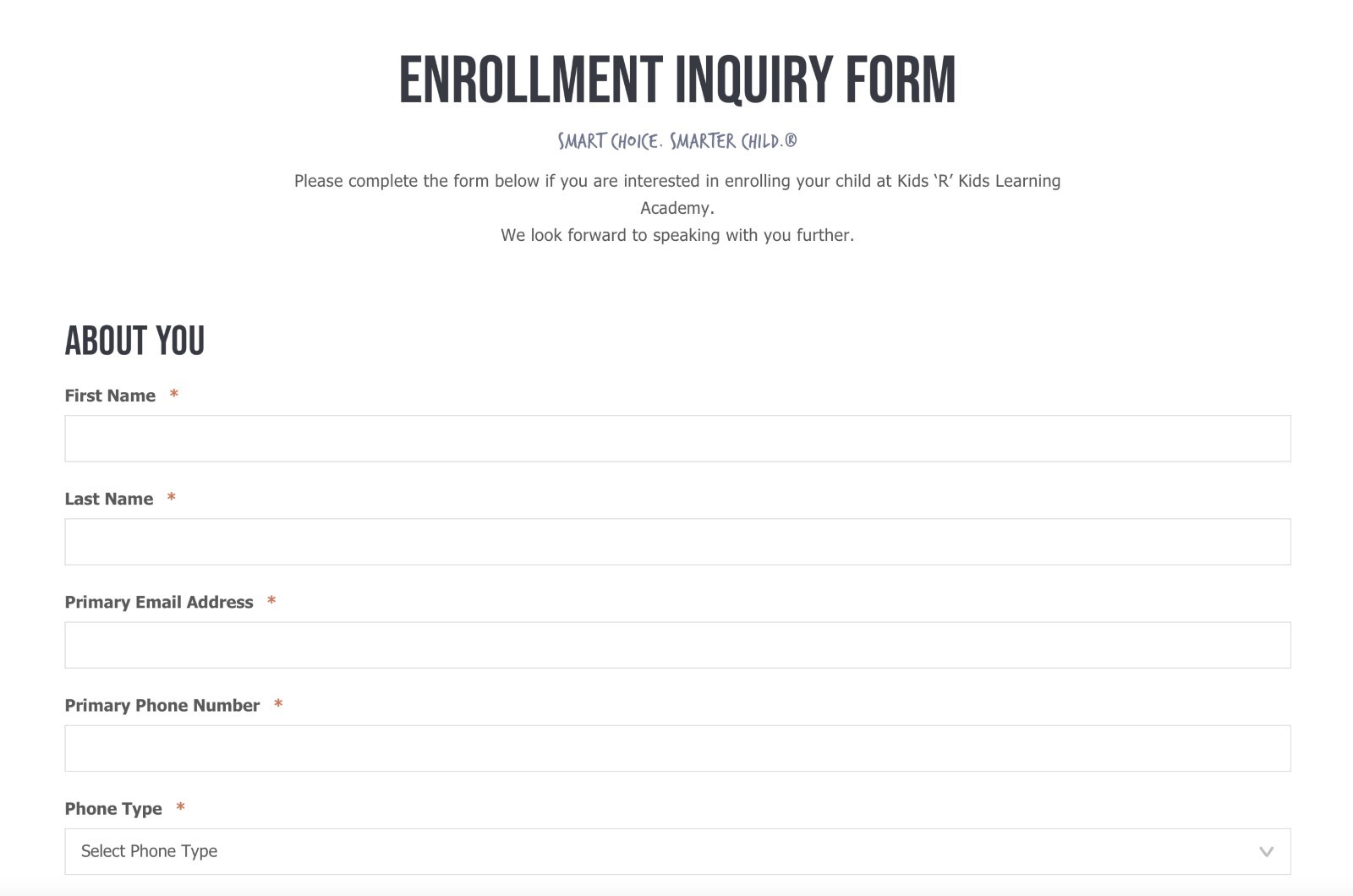
Landing page example 4: Kids R Kids enrollment inquiry form
What Makes This Work:
-
Bolded title of form – above the fold
-
Includes their slogan and a positive message
-
Identifies what the form is for
5) Code Ninjas
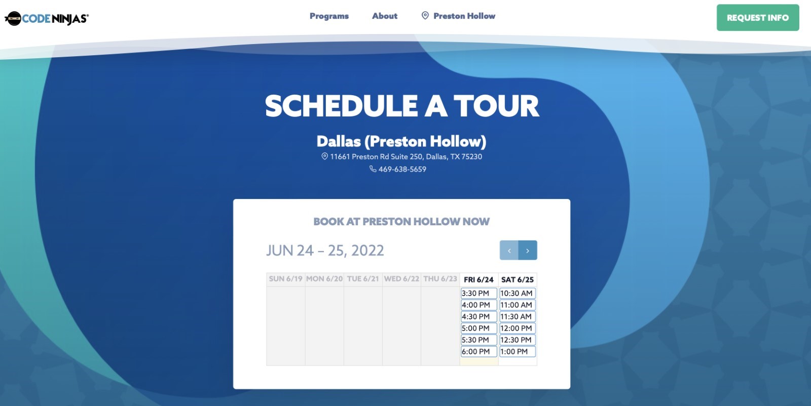
Landing page example 5: Code Ninjas schedule a tour form
What Makes This Work:
-
Sleek, clean design
-
Bold, readable colors and fonts
-
Eye-catching abstract background
6) Kiddie Academy
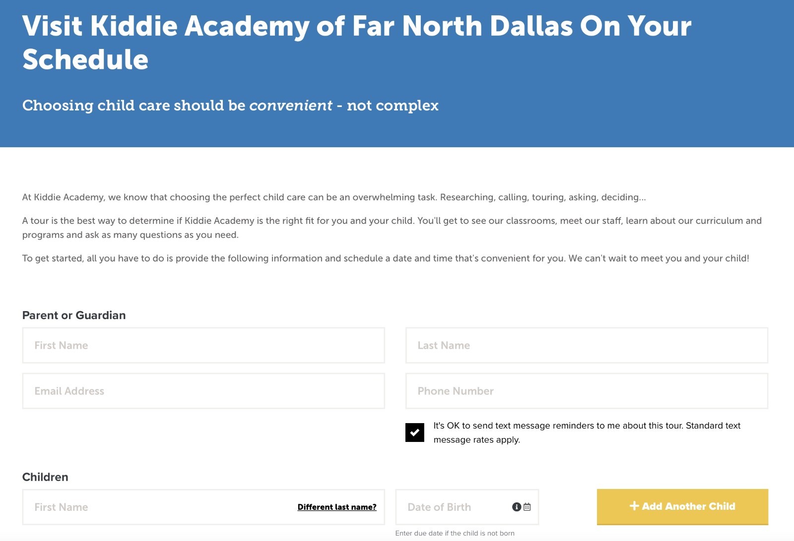
Landing page example 6: Kiddie Academy schedule a tour form
What Makes This Work:
-
Bolded font, location listed, slogan included
-
Brief, positive message – above the fold
-
Customizable – parents have the choice to receive automated messages
7) Childcare Network
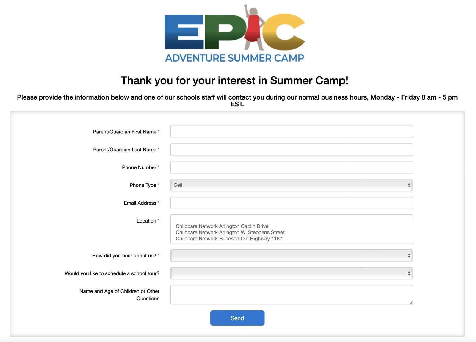 Landing page example 7: Childcare Network summer camp form
What Makes This Work:
-
Fresh design – good use of white space
-
Hours of operation listed
-
Pop of color in the logo
Design Stunning Landing Pages That Covert – with Less Work
Landing pages are a great way to generate high-quality family leads. Instead of missing enrollment opportunities, you’ll easily capture contact information from prospective families with these fantastic examples of landing pages. Effortlessly respond faster and personalize future communications.
Plus, with the right childcare software, you’ll streamline the enrollment process and increase conversions. For example, with LineLeader by ChildcareCRM, family information flows directly into your software. A new lead record is created – automating family data collection. Let LineLeader control the chaos and buy back hours in your day.
Not a User Yet?
Schedule a demo to see in real time how childcare software grows enrollment for you.
Already Using LineLeader?
Learn more about an easy-to-use Childcare Experience Platform that helps you design landing pages, with less work.



.png?width=352&name=Copy%20of%20Featured%20Blog%20Photo%20Templates%20(84).png)

