Here's the problem. You're simply too busy to keep up with emails every day.
Between managing all the junk and spam mail that gets sent to your inbox from bots, you rarely have time to read and respond to important emails from real-life humans… Fortunately, there’s a better way.
The Answer to All Your Problems (Well, Some of Them)
A contact form is a short, web-based form that can easily be added to any page on your website. Prospective families can inquire for care or request a tour in less than a minute by filling out your form and simply clicking ‘submit’.
Behind the scenes, the website contact form alerts you and/or your team that you’ve received a new inquiry, adds the new lead’s information to your ChildcareCRM account, and sends an automatic ‘thank you’ email to the inquiring family, informing them that you will reach out with more information shortly.
All this boils down to more inquiries, more tours, more enrollments, and fewer manual tasks for you, while also concealing your email address from bots who like to send you thousands of messages worth of spam or junk mail. Effortlessly save time and money with a website contact form.
Talk about a win-win scenario. Well, maybe not for the bots…
If You Build It (the Right Way), They Will Come
Form Fields
All contact forms are not created equal. In fact, forms with 5 fields or fewer often result in the highest conversion rates.
But a website contact form for families seeking childcare might need to include fields such as:
-
Parent/Guardian Name
-
Email Address
-
Phone Number
-
Child Name
-
Child Date of Birth
-
Location of Interest (if you have multiple sites)
-
Desired Start Date
-
Message (blank field designed for comments or questions)
Wow, that’s 8 fields right there! And those are just off the top of my head… So, if you’re using a longer form with more than the previously suggested 5 fields and you’re not quite ready to sacrifice all that information, consider removing fields such as ‘state’, ‘city’, or ‘country’ and replacing them with ‘zip code’. This provides you with the same location-based insight but removes friction for the inquiring parent or guardian.
Removing as few as one form field can boost your contact form submissions by as much as 26%.
Call-To-Actions
Also, when designing your form, make sure to include an enticing CTA (Call-to-Action) that will encourage your website visitors to submit their inquiries. Some suggested CTA’s include: “Submit”, “Contact”, “Send”, and “Send Message”. However, you can also get a little creative and spice your website up with CTA’s like: “Say Hi!” or “Get in Touch”.
Formatting and Design
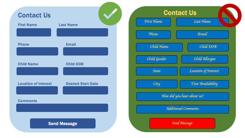
Now for the *aesthetics*. Get your website visitors ‘oohing and ahhing’ before they even step foot in your building… First, left-aligned form field labels increase readability and actually boost the number of form submissions you’ll receive from families. Also, it’s proven that prospects prefer the labels to be placed on top of the form fields rather than below or inside the field.
Next, include headers and form titles in fonts that are easy to read. Start by using a font that matches your brand and the rest of your website but try to avoid anything too decorative. Be sure to use colors that sync up with your logo or other website images but don’t overpower the actual content in the form.
Check out these examples of a visually appealing contact form and a contact form that basically just makes you want to throw away your computer…

Form Placement
Finally, always try to include forms above the ‘fold’ of your website. In other words, think of your website like a newspaper (do people still read those things?). In traditional print newspapers, there was a fold in the middle of a very long page. Everything above that fold was what media outlets and journalists wanted your eyes to land on first.
So, when thinking about where to put a contact form, make sure it’s one of the first things that prospective parents see as soon as they open your webpage.
For more ways to save time by automating each stage of your enrollment journey - take a peek at the webinar below.
Make It Easy for Parents to Inquire with a Website Contact Form
If you own/operate a childcare business (no matter the size), it's important for prospective families to be able to contact you quickly. Whether they want to schedule a tour, enroll for care, or ask questions, an easy-to-use contact form is the first step into growing your enrollment and building a waitlist.
But, as your business grows, you’ll constantly get more and more inquiries from your website.
How will you keep up?
Easy: by using ChildcareCRM to ensure all new leads enter your CRM account immediately and receive an automatic follow-up via email and/or text.


%20(3).png?width=352&name=featured%20images%20for%20blog%20(1530%20x%20982%20px)%20(3).png)
.png?width=352&name=_blog%20roundup-%20email%20images%20(4).png)
